

Each year, Ben Carlson updates his asset allocation quilt chart, detailing the performance of different market segments from the previous year.
Speaking of Ben Carlson, he deserves a shoutout. The graphs and charts he puts together are always easy to visualize and understand. I share them frequently in this newsletter, and I’m going to use a few more today.
Before getting into the numbers, here’s a key to help understand the chart:
Large Cap – Big U.S. stocks. Think Apple, Amazon, and Google.
Mid Cap – Medium-sized U.S. stocks. Think DocuSign, Zoom, and Monster Energy.
Small Cap – Small U.S. companies. Think Cracker Barrel, Crocs, and Etsy.
REITs – U.S. real estate.
EW – An equal-weighted portfolio of U.S. stocks. Meaning each stock within the portfolio is given the same weight or allocation regardless of its size.
Int’l Stocks – International stocks across 21 developed market countries within Europe, Australasia, and the Far East.
EM – Emerging markets include stocks across 24 emerging market countries like Brazil, Poland, and Greece.
Bonds – Total U.S. bond market.
TIPS – Bonds issued by the U.S. government that adjust their value based on inflation.
Cash – Self-explanatory.
Comdty – Commodities like gold, silver, crude oil, and natural gas.
Ok, here’s the latest update through 2025, along with trailing 10-year returns:
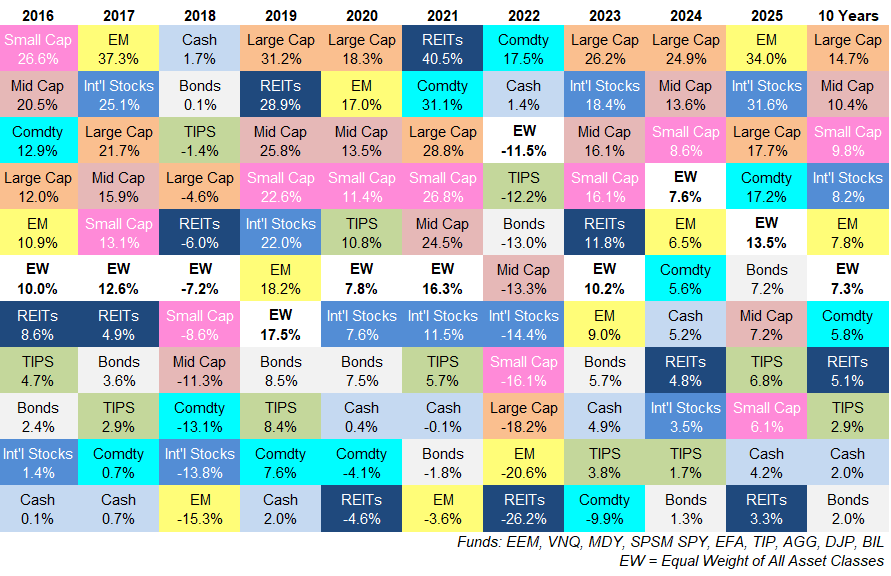
Emerging markets took the crown as the best-performing asset class in 2025 with a massive 34% return. That 34% is the third-highest single-year return of any asset class during the past decade, only behind emerging markets in 2017 and real estate in 2021.
After a decade that’s largely been dominated by the S&P 500 (U.S. large cap), 2025 was the first year since 2017 in which both international categories beat the S&P 500.
Despite a bounce-back year for bonds in 2025, they’ve had the worst overall performance over the past 10 years.
I also think it’s noteworthy that real estate was the worst performer this past year.
What’s great about the chart is that it displays the variable nature of returns.
Sometimes one asset class will perform great for one year and then plummet the next. Other times, an asset class will perform well for a few years in a row. One year, commodities will be the top-performing asset and then be the worst the very next year. Or maybe an asset class stays in the middle for an extended period of time.
There is no rhyme or reason to asset class performance from one year to the next.
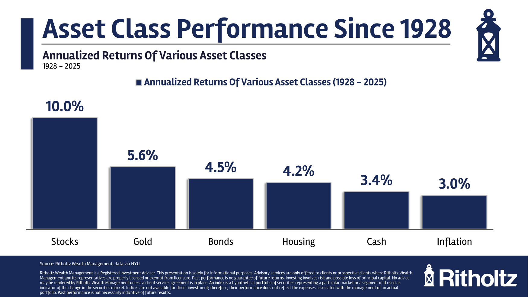
However, as we take a step back to look at performance over long periods of time, the data becomes more consistent. Here’s another chart from Ben Carlson showing broad asset class annual returns since 1928:
Here’s each asset class return broken down by decade:
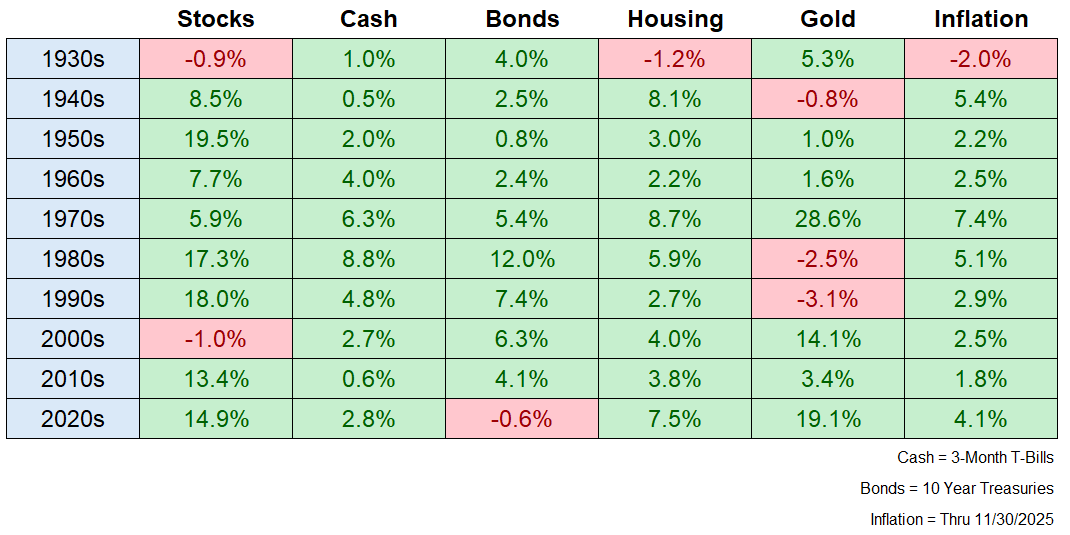
You can take a look at the data and come to your own conclusions, but I’m glad he included inflation alongside the other returns. If you look at the 4% inflation rate for the first half of the 2020s, it doesn’t look as bad when you compare it to previous decades. Especially coming off a decade with the lowest inflation in 80 years.
So, how do you prepare for the variable nature of returns between asset classes?
Well, the cool thing about investing is that there are many ways to go about it. You don’t have to try to pick the biggest winners year to year.
Instead, you can admit you can’t predict the future and buy a globally diversified basket of stocks and other assets.
Who knows what will be the best-performing asset in 2026. But regardless, the long-term returns will stay consistent.
That discrepancy highlights a key investing lesson.
Thanks for reading!

Jake Elm, CFP® is a financial advisor at Dentist Advisors. Jake a graduate of Utah Valley University’s nationally ranked Personal Financial Planning program. As a financial advisor at Dentist Advisors, he provides dentists with fiduciary guidance related to investments, debt, savings, taxes, and insurance. Learn more about Jake.